Tap tablet image below to read my full case study on WellthySoul.com or simply scroll down to see an abridged version.

Click image above to see full case study on my UX Portfolio!
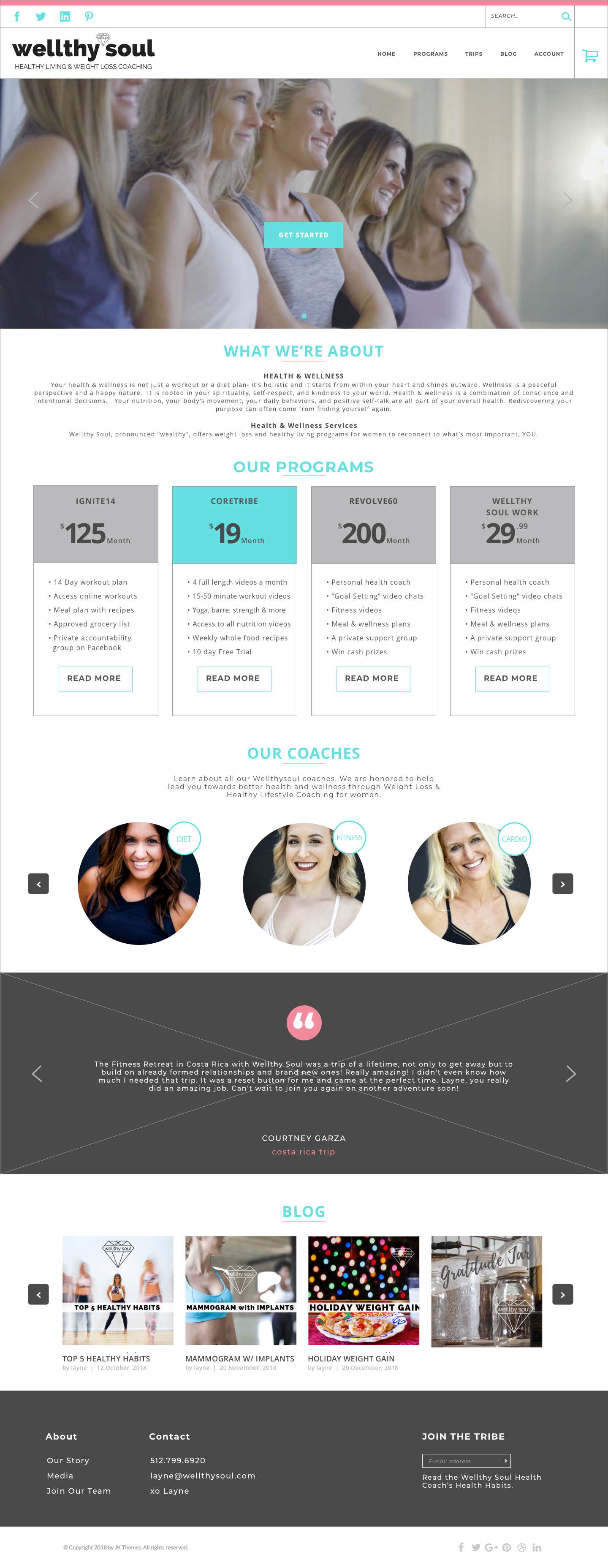
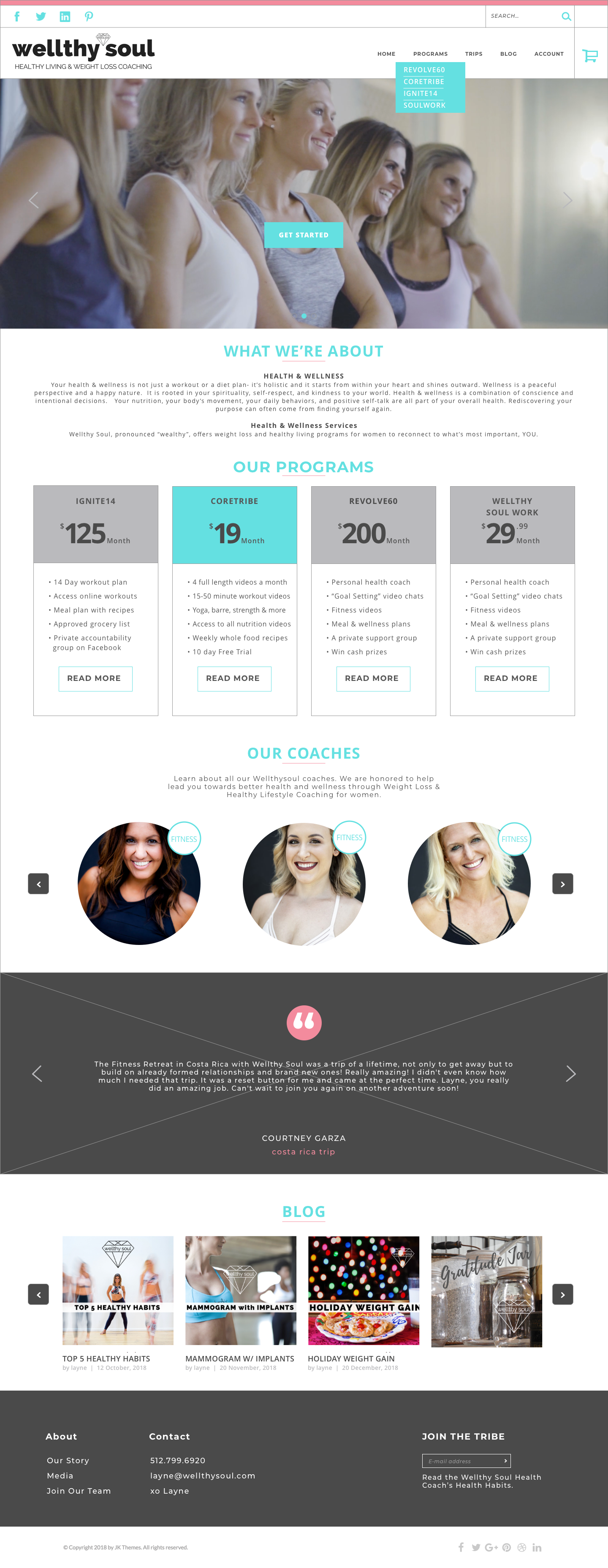
Below is an example of the original homepage. The main menu was full of features and the best way to find the stakeholders main online programs to to rollover the Membership menu button.
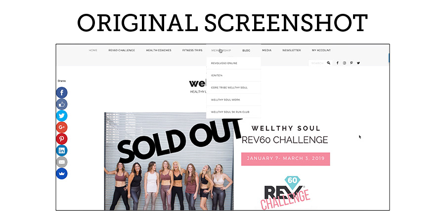
Thanks to our research we were able to justify removing a lot of these features from the homepage and focus more on how to get started, what are the program prices and their differences.
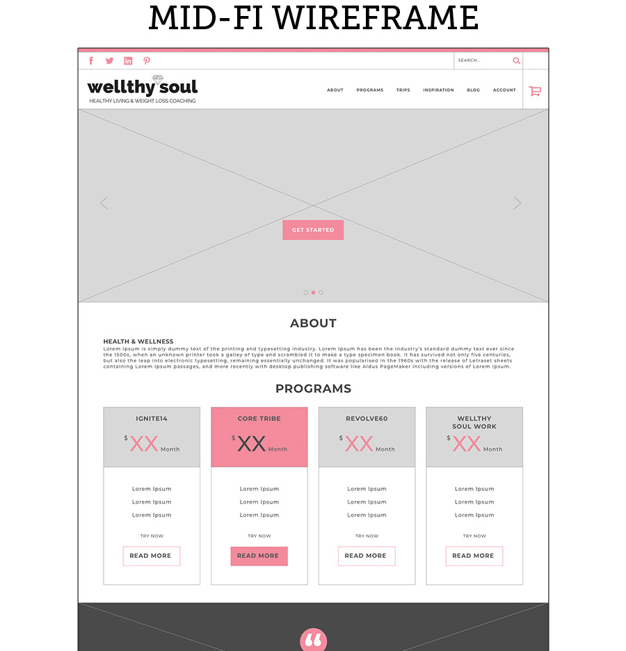
Tap the button below to see the prototype I made using Sketch and InVision. It was a great tool for user testing to verify my designs.
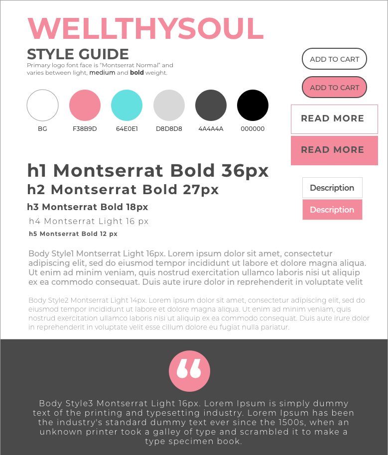
I also designed the style guide below using sketch to match the similar color scheme Layne(our stakeholder) approved. This reduced confusion with my team and provided context while we built assets for our client.
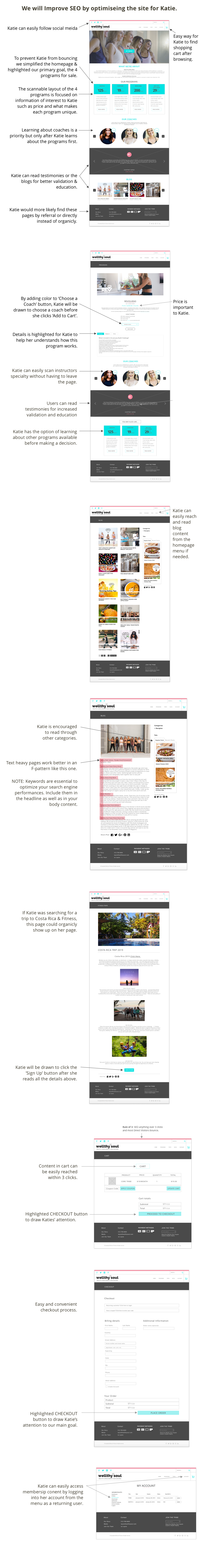
Click on the images below to see detailed annotated hi-fidelity wireframes.
Thanks for visiting. To learn more about my design process for Wellthy Soul and really dig into the details testing, research and insights, please click the button below to visit my UX Portfolio.